A continuation from my previous post, this time we are going to do more charting to find correlations between multiple stocks.
1. Packages Required
import pandas as pd
import matplotlib.pyplot as plt
import seaborn as sns
import pandas_datareader.data as web
from datetime import datetime
%matplotlib inline

end = datetime.now()
start = datetime(end.year-2, end.month, end.day)
We import in the necessary packages in jupyter notebook and set the date range as 2 years.
2. Import Multiple Stock Data from Yahoo Finance
FCT = web.DataReader("J69U.SI", 'yahoo', start, end)
CMT = web.DataReader("C38U.SI", 'yahoo', start, end)
SGX = web.DataReader("S68.SI", 'yahoo', start, end)
SLA = web.DataReader("5CP.SI", 'yahoo', start, end)
MIT = web.DataReader("ME8U.SI", 'yahoo', start, end)
SING = web.DataReader("Z74.SI", 'yahoo', start, end)

# create new dataframe with just closing price for each stock
df = pd.DataFrame({'FCT': FCT['Adj Close'], 'CMT': CMT['Adj Close'],
                   'SGX': SGX['Adj Close'], 'SLA': SLA['Adj Close'],
                   'MIT': MIT['Adj Close'], 'SING': SING['Adj Close']})
df.head(2)
And then we import a bunch of data from SGX. In order: Frasers Centrepoint Trust, CapitaMall Trust, Singapore Exchange, Silverlake Axis, Mapletree Industrial Trust and Singtel.
3. Plot Multiple Stocks
df.plot(figsize=(10,4))
plt.ylabel('Price')
And plot each stock in a single line chart.
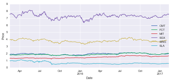
As each stock has different prices, it is difficult to compare between them to visualise any relationships. Some transformation can help to normalise this issue.
3. Normalising Multiple Stocks
returnfstart = df.apply(lambda x: x / x[0])
returnfstart.plot(figsize=(10,4)).axhline(1, lw=1, color='black')
plt.ylabel('Return From Start Price')
In this instance, credit to this blog, I divided all the closing price to the first closing price in the period.
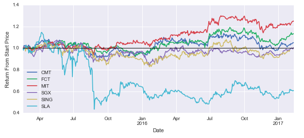
Now this is more comparable. Imagine if you bought at that start date. 2 years later, you would have profited decently from MIT, followed by FCT and CMT. SLA lags behind as it has a financial scandal that crashed the stock by half, and it never recovered fully from it. All other companies aside of SLA seems to follow a similar trend.
Another way is the plot the daily percentage change of stock price.
df2=df.pct_change()

df2.plot(figsize=(10,4))
plt.axhline(0, color='black', lw=1)
plt.ylabel('Daily Percentage Return')
This is very easy to calculate within pandas, with just one line of code ‘pct_change()’.
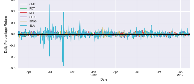
Because I have 6 stocks overlapping each other, it is a little hard to make any comparisons here. But it is clear that SLA is the most volatile with the spikes being higher than all other stocks.
It is better to have some hard numbers so lets do some correlation plots.
4. Correlation Plots
sns.jointplot('MIT', 'SLA', df, kind='scatter', color='seagreen')
In this instance, seaborn’s jointplot is used to compare between two stocks. A Pearson’s correlation is conducted.
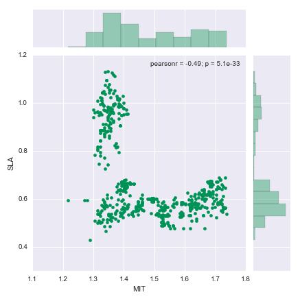
Just looking at the chart, you can see that the relationship is hardly linear.
plt.figure(figsize=(8,8))
sns.corrplot(df.dropna())

#corrplot is depreciated, thanks for a reader pointing it out,
#use the code below instead.
#sns.linearmodels.corrplot(df.dropna())
Rather than doing this pair by pair, seaborn offers multiple pairs of correlation to be conducted using corrplot. Note that seaborn does not accept null values, so ‘dropna()’ is applied in case there are any.
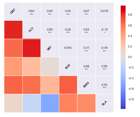
CMT, FCT and MIT are all in the same sector (REITS), hence it is not surprising that they are strongly correlated. Strongly correlated stocks are used in pair trading, and these could be ideal candidates.
fig = sns.PairGrid(df.dropna())

# define top, bottom and diagonal plots
fig.map_upper(plt.scatter, color='purple')
fig.map_lower(sns.kdeplot, cmap='cool_d')
fig.map_diag(sns.distplot, bins=30)
PairGrid can be used for paired comparisons with flexibility on the type of charts being plotted. For this case, a scatterplots, kde plots and histograms are plotted.
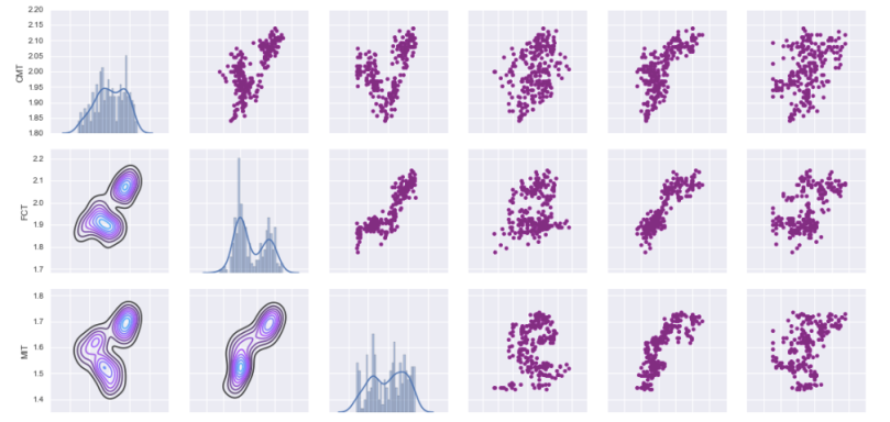
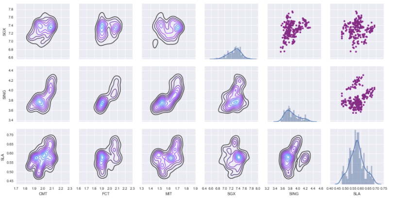
It is now clear why CMT, FCT and MIT are correlated and why others are less so.
Still scratching the surface in this post. But hope my readers can gain more insights on charting stocks using Python. Hope to dive further into this soon with another post in this series.
See also:

[…] Python for Stocks: 2 […]
LikeLike
thanks for this – part one was great too.
Looking forward to the next one 🙂
LikeLike
by the way, corrplot was deprecated since v0.6, so for me it raised an error.
For now, it can be solved by changing sns.corrplot(df.dropna()) to sns.linearmodels.corrplot(df.dropna())
LikeLiked by 1 person
Thanks @BC, I should be using the older version of seaborn. Glad you found the way out!
LikeLike